I recently came across a University of Indiana study that advertisers are increasingly turning to subliminal ads to woo millennials (who knew millennials had subliminal…anythings?). From sex to software, the study said, an Internet-fed generation increasingly relies on fleeting visual clues for information.
The study wasn’t much of a jaw dropper: Journalism had to do a similar bait-and-switch years ago, cloaking itself as comedy to inform its once-attentive clientele. Hence the rise of politically canny comedians like Jon Stewart, Bill Maher, John Oliver, Samantha Bee, Larry Wilmore and Trevor Noah. Speaking of which: Why do the Republicans not utilize humor? With the exception of Dennis Miller, the GOP is known more for blowhards than belly splitters.
The study found this ad, apparently from the U.S. Dept. of Agriculture and Arousal, to be among the worst offenders:
Beer commercials, it said, remain among the most flagrant. Here’s one from Lowenbrau:
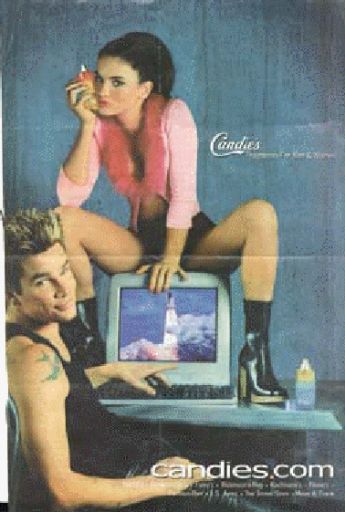
The most sexist ad of the year, however, went to a fashion site known as Candie’s. Where, the study asked, what the rocket going? And what did that have to do with fashion?
But the study also gave credit to companies whose primary advertising charm was in cleverness, not sexiness:
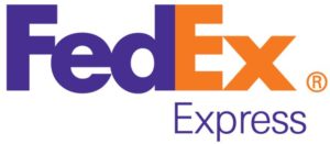
FEDEX
The white space between the ‘E’ and the ‘X’ forms a perfect arrow, suggesting a company moving forward and looking ahead. It’s subtle, but now it’s all I see whenever the logo appears.
GOODWILL
The iconic smiling face is in fact the ‘G’ in Goodwill zoomed in an cropped slightly.
THE PITTSBURGH ZOO

On either side of the tree, the faces of a gorilla and lion appear in white. In many of these examples of hidden symbolism, the ‘secondary’ imagery is often found by looking at the ‘negative space’ of the logo.
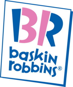
BASKIN ROBBINS
The BR in the Baskin Robbins logo is made of two colours. When you focus on just the pink portion, the number 31 appears, denoting the number of flavors Baskin Robbins offers.
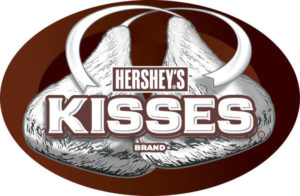
HERSHEY’S KISS
The tasty Hershey’s Kisses logo is similar to the FedEx logo in that there is a hidden Hershey’s kiss between the ‘K’ and the ‘I’. You might need to tilt your head slightly to the left to really see it.
AMAZON
My favorite of the bunch. Did you ever notice the arrow from ‘A’ to ‘Z’ in the Amazon logo? The thought is that Amazon carries everything from… well you know the rest. Some say it also forms a slight smiley face.
But I think Amazon killed two birds with a single stone. Sure, there IS an ‘a’ and a ‘z,’ and it certainly looks like a smiley face.
Or maybe Amazon is smiling because it is sitting on its own erection.
Perhaps sex does sell. Whether you’re buying or not.

